Sacred Bookends

Context and Problem
Sacred Bookends is a physical guided journal created for life coach Val D’Ambrosio as part of her coaching practice. The journal translates her routine framework into a tangible product, helping users build intentional daily structure through what she calls “bookends”—containerized moments at the start and end of each day.
PROBLEM
Many people struggle to maintain routines because traditional habit systems are rigid and all-or-nothing, often leading to burnout or abandonment.
SOLUTION
Sacred Bookends introduces a flexible routine model built around two daily containers: morning and evening. Rather than prescribing fixed tasks, the journal allows users to choose habits based on energy and intention, supporting consistency without requiring the same actions every day.
MY ROLE:
Lead Creative Designer and Product Owner
DURATION
: 4 months
Research
This project was part of a broader brand transition from one-on-one coaching to a collective offering guides, courses, seminars, and retreats. In parallel with designing Sacred Bookends, I led multiple brand alignment sessions to help define the client’s voice, values, and visual direction, and to position the journal within her evolving ecosystem.
The client envisioned a brand that felt whimsical, feminine, and spiritual to support the fluid nature of containerized routines, while still incorporating a grounded, structured counterpart to reinforce consistency. To inform this balance, I studied influencers in the spirituality and femininity space, as well as ADHD-focused creators whose guided journals and habit systems intentionally move away from rigid, prescriptive models.
Across these references, common patterns emerged: clearly containerized sections, lightweight interaction patterns, and multiple ways to engage beyond writing. Features such as checkboxes and circled options ensure users can still participate on low-energy days, reinforcing consistency without pressure.
Ideation
Early ideation focused on translating the concept of “bookends” into a visual and structural system that felt both grounding and flexible. I initially explored brown and neutral palettes paired with literal book imagery to evoke ritual and strength, but this approach quickly felt too literal and restrictive.
I shifted toward using the rhythm of a day—morning, daytime, and evening—as the organizing metaphor, allowing color, symbolism, and structure to communicate the concept without requiring explanation.
Iteration
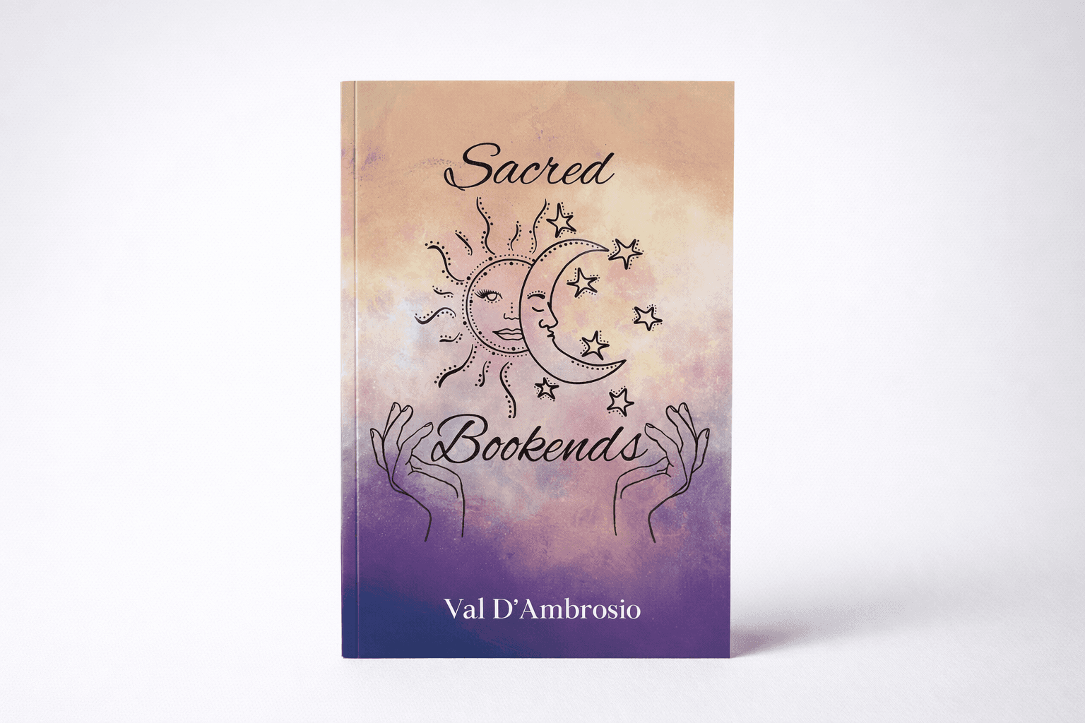
The visual system evolved into a three-palette approach aligned with the daily cycle: warm red–orange–yellow tones for the morning bookend, deep blues and purples for the evening bookend, and a monochromatic yellow palette for the daytime journaling section in between. This shift introduced a softer, more feminine and whimsical tone while preserving structure through clear visual separation. Literal book imagery was replaced with custom hand illustrations used as the bookends, symbolizing intention and the act of consciously holding space at the beginning and end of the day.
To balance softness with strength, I chose the Maharlika typeface. Its sharp edges convey structure, while its dramatic serifs retain expressive warmth. Content was further iterated into modular, containerized sections, creating a “choose your own adventure” experience rather than a linear routine. Guided content and journaling pages were intentionally separated to reduce cognitive load and make it easier for users to reference information or return to writing without friction.
Once the project was printed, reviewing the first physical copy revealed that much of the text and illustration work was too small for comfortable reading. Using this hands-on feedback, I reformatted the layout to further break up content: each “how to use this section” explanation was given its own page, and routine suggestions were separated into individual spotlight pages. This iteration significantly improved readability, reduced overwhelm, and allowed each activity to feel intentional and approachable.
V2 RELEASE TIME: 3 weeks
Outcome
Sacred Bookends launched as a fully printed, client-ready guided journal aligned with a broader brand transition into scalable offerings such as guides and courses. The final design supports flexible routine-building through clear visual hierarchy, containerized choices, and low-friction interactions that meet users where they are energetically.
KEY LEARNINGS
Flexibility drives consistency: Designing for variable energy levels (through modular layouts and lightweight interactions) reduces friction and increases follow-through.
Physical artifacts reveal invisible problems: Reviewing the first printed copy surfaced usability issues that were not apparent on screen, reinforcing the importance of real-world testing.
Structure and softness can coexist: Balancing expressive visuals with disciplined typography and layout created a system that feels supportive without sacrificing clarity or rigor.
